Elisa Exchange Visual Identity Explained
When creating a visual language for a complex and innovative platform like Elisa Exchange, it is important to make the user experience as simple and intuitive as possible. To achieve this, we have created a unique pattern based on geometric shapes and lines that make the design dynamic yet solid.
The Journey from Research to Concept
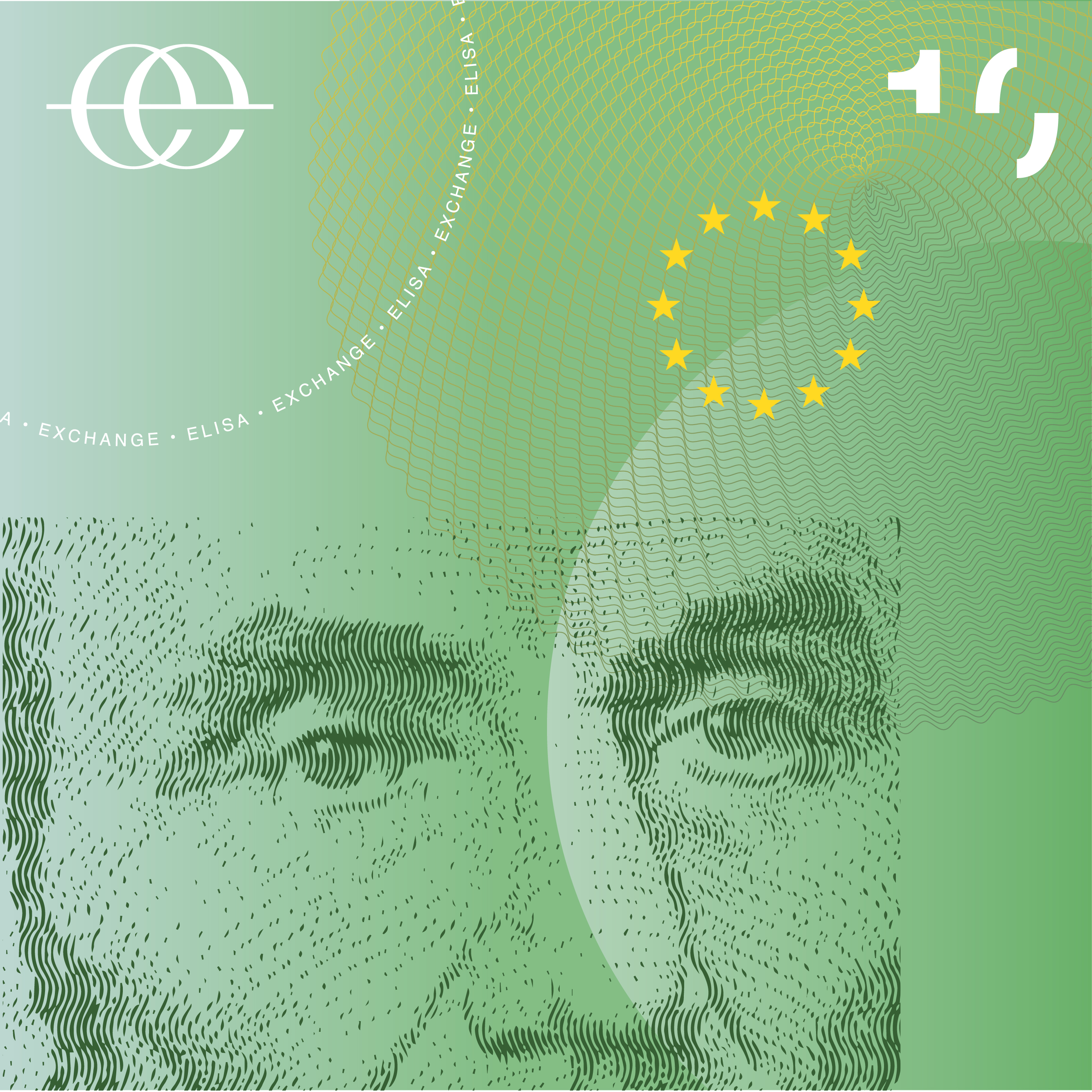
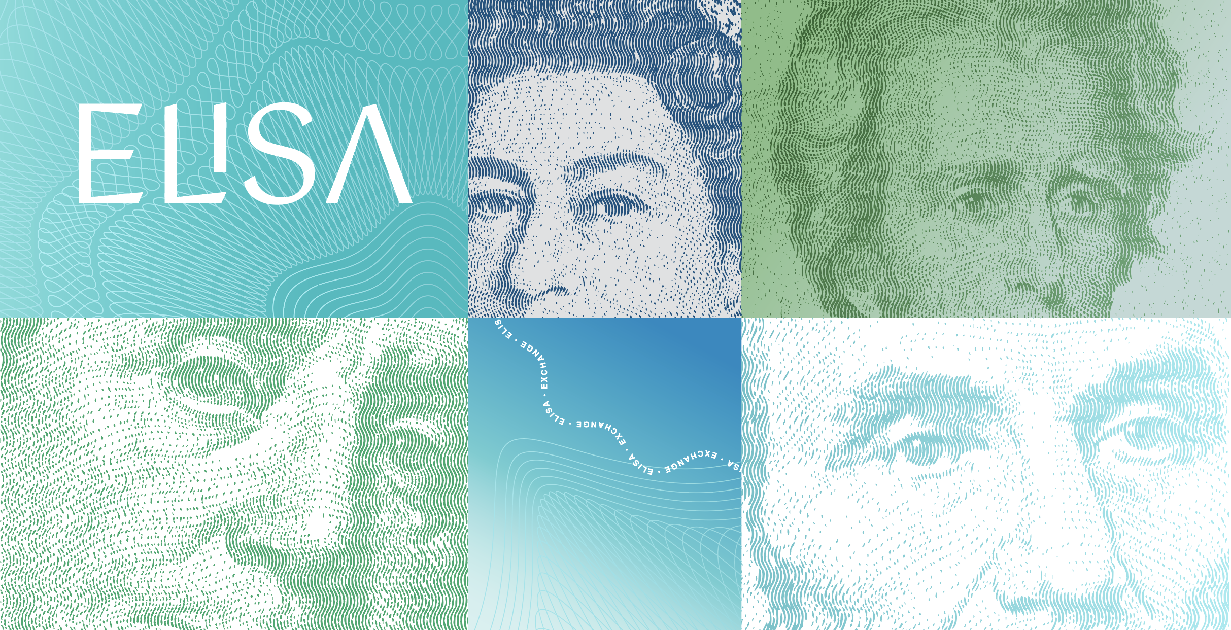
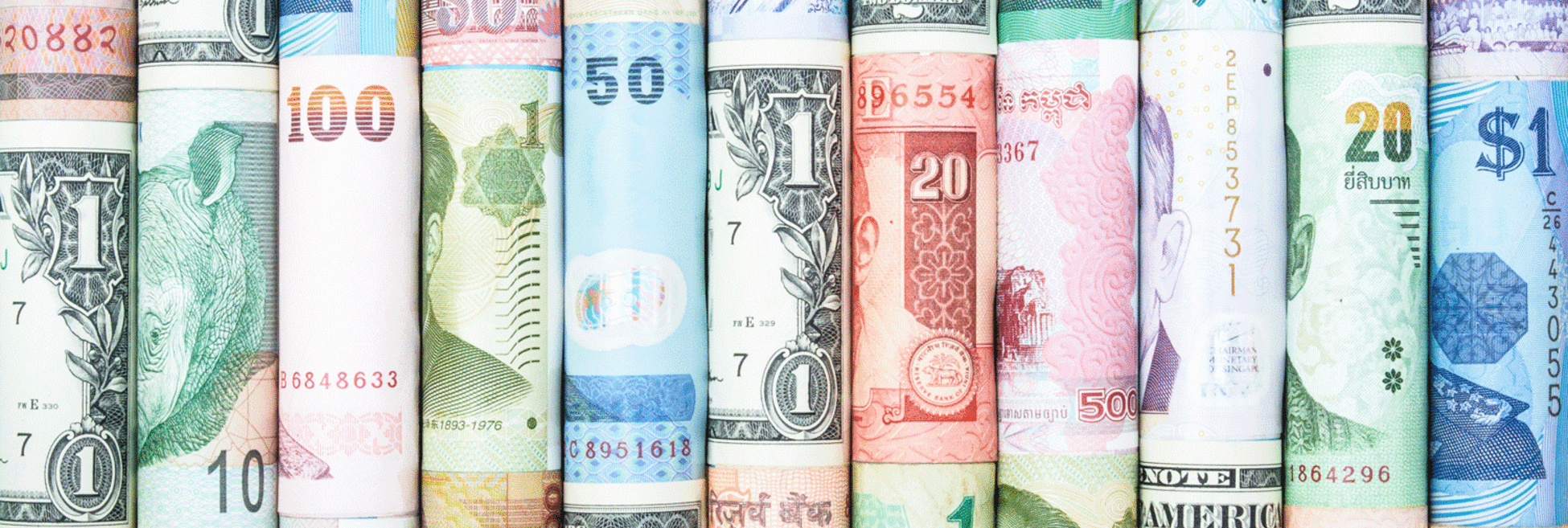
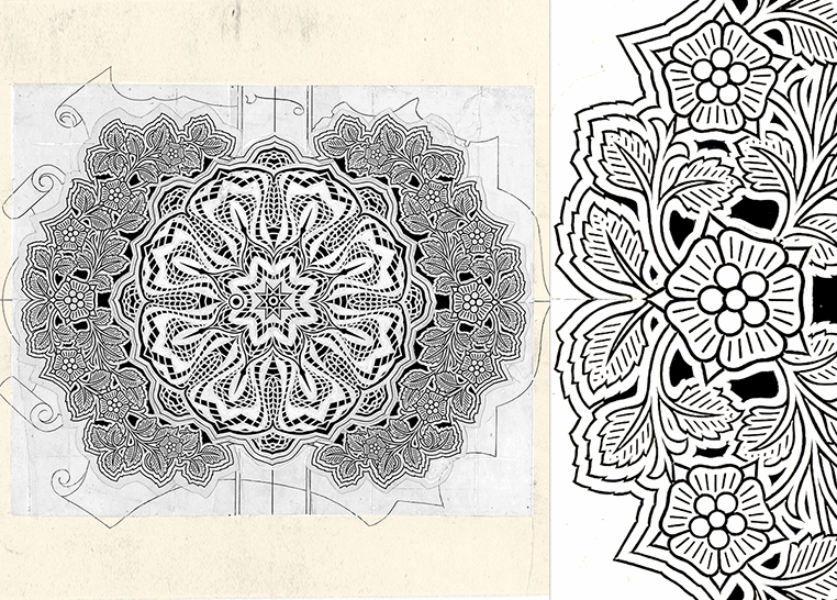
Before starting the design process, we went through all the currencies and banknotes from around the world to find the common principles among them. Banknotes share significant features. Most of them have a green/blue(ish) color, with an illustration of a public figure/animal/landmark, and intertwined circular and spiral lines called guilloché.
Guillochés are vintage design motifs that have been used as anti-counterfeiting security on banknotes, passports, checks, and certificates for over two centuries. Even though as technology advanced and digital copy and printing technologies improved, guillochés no longer provided enough security measures to prevent the forging and counterfeiting of precious materials.
Guilloché patterns were first used as a security feature, but have remained a part of banknote design.
Setting up our mood boards and bringing together the research results, we decided to make these linear patterns one of the core elements of Elisa’s visual language.
Developing the Patterns
The following challenge we faced was the production of guillochés, but we soon realized that creating them was not as enchanting as admiring their beauty. Guilloché patterns, commonly found on banknotes, are intricate designs consisting of intertwined lines arranged in circular or spiral shapes. These patterns are engraved through a mechanical process to enhance the bill’s security against counterfeiting.
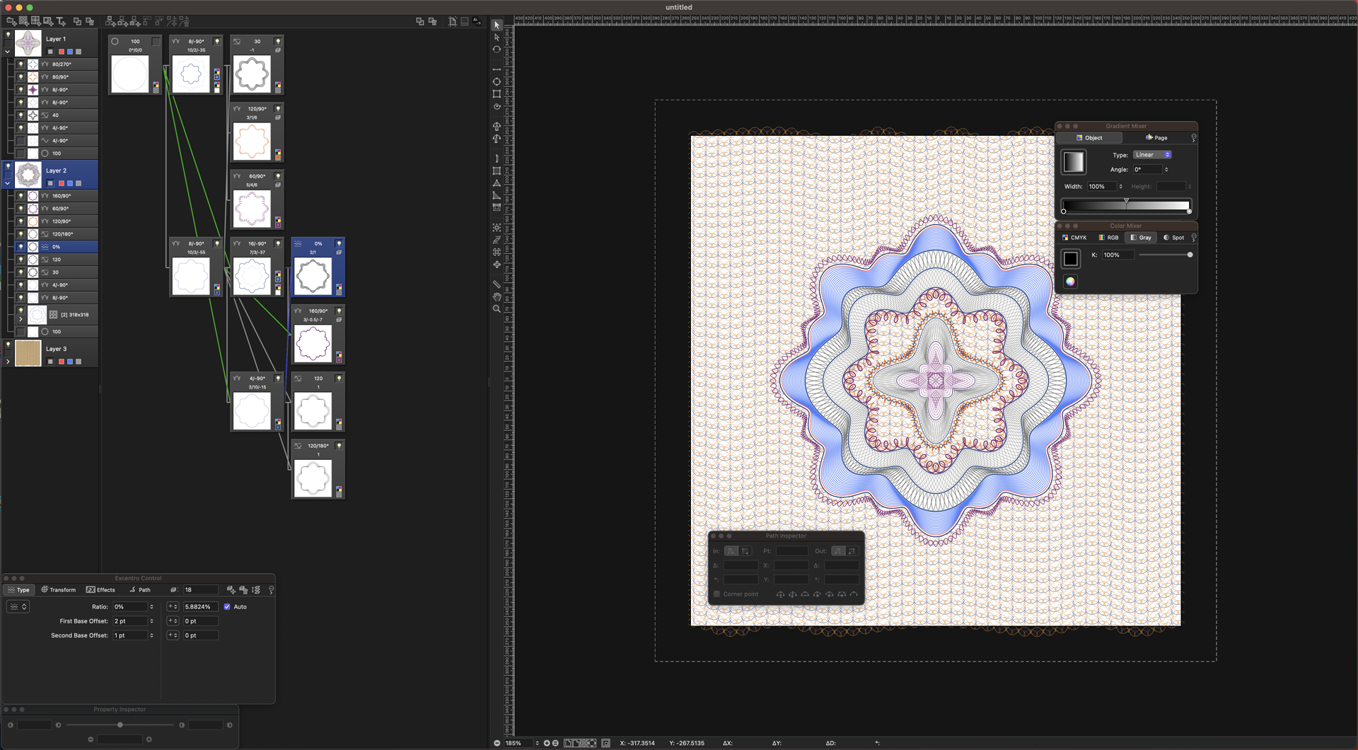
To tackle this challenge, we aimed for a more efficient tool specifically designed for creating complex patterns. That’s when we discovered Excentro. Excentro is a powerful yet user-friendly software that enables the creation of guilloché designs such as backdrops, borders, and rosettes. By utilizing Excentro, we were able to harness its capabilities and streamline the process of generating guilloché designs. This tool provided us with the necessary precision and flexibility to bring our vision to life, ensuring that the resulting patterns were visually stunning and met our desired standards.
Colors and Typeface
When designing an Arabic typeface for an Exchange Services brand, careful consideration must be given to cultural aesthetics and readability. The typeface should embody the essence of the brand while maintaining legibility and clarity. Arabic calligraphy’s rich history and artistic tradition can serve as a source of inspiration, blending traditional elements with a modern twist.

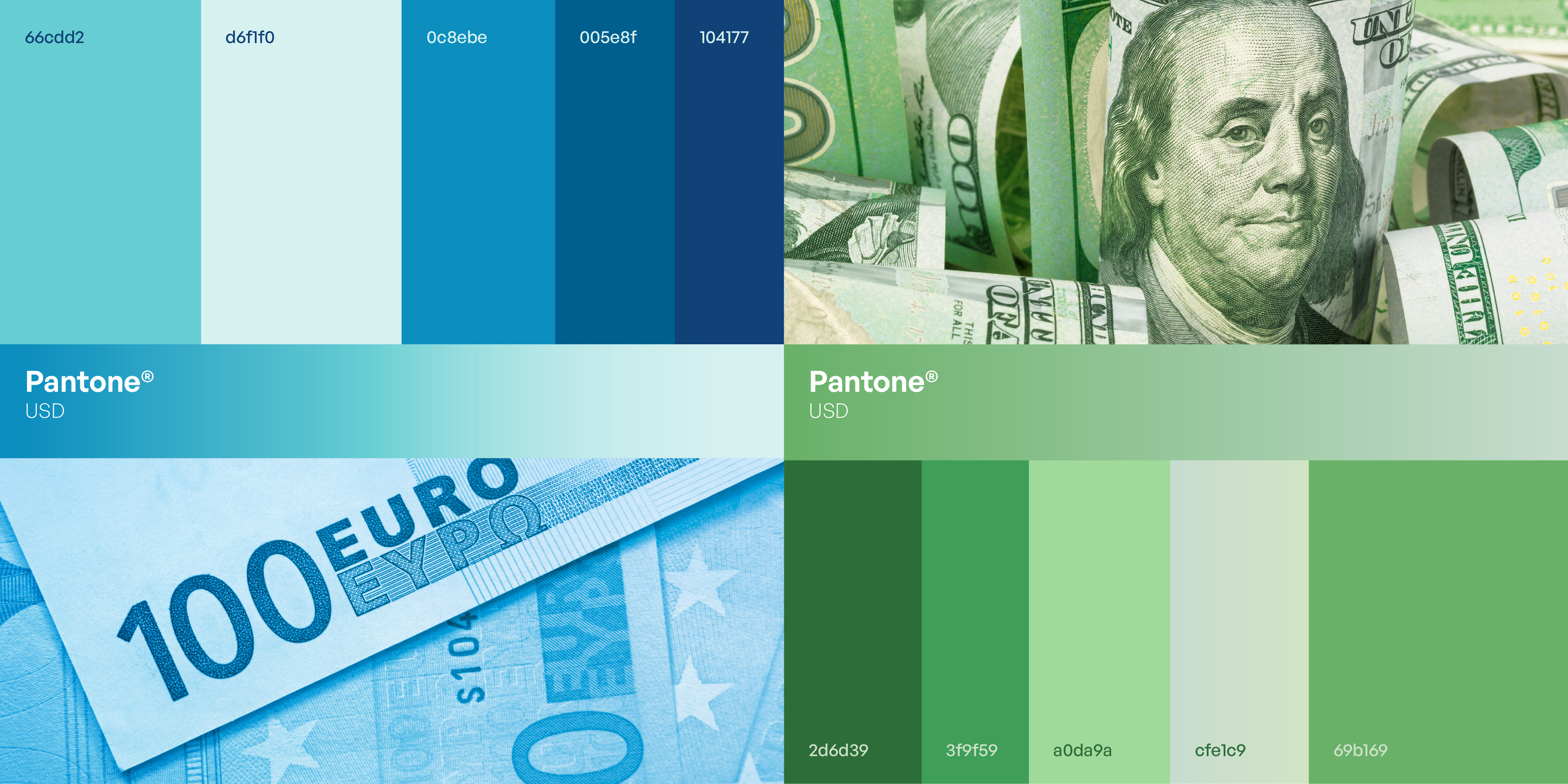
The choice of green and blue colors can further enhance the brand’s identity. Green symbolizes growth, prosperity, and stability, reflecting the reliability and trustworthiness of the Exchange Services. Blue, on the other hand, represents security, professionalism, and integrity, instilling a sense of confidence in the brand. The combination of these colors can create a visually appealing and harmonious palette that resonates with the target audience and reinforces the brand’s values.
The Outcome
Finally, all of the elements work together to create a distinct brand identity for Elisa Exchange. The process of going from research to concept allowed us to discover common principles found in currencies and banknotes around the world, which led us to include guilloché patterns as a core element of Elisa’s visual language. We efficiently produced intricate guilloché designs with the assistance of a new tool, ensuring both visual appeal and efficiency. Colors were carefully chosen, and an Arabic typeface was created to reinforce the brand’s identity, instilling trust, professionalism, and integrity. Elisa Exchange now has a visually appealing and culturally resonant brand identity that engages and connects with its target audience thanks to careful consideration of each element.